A Fresh Coat

bathroom makeover

Boys BOHO Bathroom

BathroomJenny SulpizioComment

I’ve mentioned before that I truly love the Bohemian style. It’s minimalist, however, it’s packed with personality. There really aren’t any rules and you can mix so many pieces together to come up with a really fun space.

When asked by “H’s” mom if I could remake his bathroom into a space that would coordinate with his bedroom, I was all over it. Not only do I love BOHO, but I love coordinating rooms together based off of this style. So, here is where we started.

Boys BOHO Bedroom 1 copy.jpg

Since “H’s” bedroom got a sweet black chalkboard wall with a color palette of black, white, and butterscotch, I wanted to make sure I carried over these colors into the loo. This bathroom is attached and easily visible from his bedroom so it need to have some cohesion.

It started with the vision board:

Harrison's Boho Bathroom.jpg

Let’s just say I had a ton of fun creating this space because “H’s” mom gave me full creative liberties. So when I mentioned creating board and batten moldings in this amazing butterscotch hue (Valspar’s Butcher Block), she didn’t even bat an eye! Love that! When I introduced the idea of Swiss cross decals and leather pulls for the cabinetry doors and drawers, she was on board. Swoon! And when I mentioned painting the vanity in a shade of black, she said “yes!” Sweeeeet!

Boys BOHO Bathroom 2.jpg

Valspar’s Dogwood Petals and Butcher Block going on the walls and trim!

Boys BOHO Bathroom 3.jpg

After three coats of this beautiful, creamy white (four coats at the crown and edges), and only two passes using this butterscotch hue, the bathroom was starting to take shape! “H’s” mom opted for the chair rail over the board and batten and even installed it for me (that girl is handy)!

Next up? Swiss cross vinyl appliques. Now, these could have been painted on but in an effort to keep this as semi-permanent (and uniform) as possible, I opted for decals. Plus, they are super inexpensive and truly make the top portion of this wall all the way around the room.

Boys BOHO Bathroom 4.jpg

These cute, little, inexpensive X’s (available on Amazon) are totally making this space come to life at this point. This also happens to be the part where I start getting all giddy over my client’s spaces because they are right on the cusp of completion.

So, how about the “after” shots?

Boy's BOHO Bathroom 10-2.jpg

You guys! I love this space. I love every detail that went into it. Believe me when I tell you that there is a lot of love, thought (and sweat) that went into the creation, execution, and installation of this one space.

Let’s start with some details:

Boy's BOHO Bathroom 7.jpg

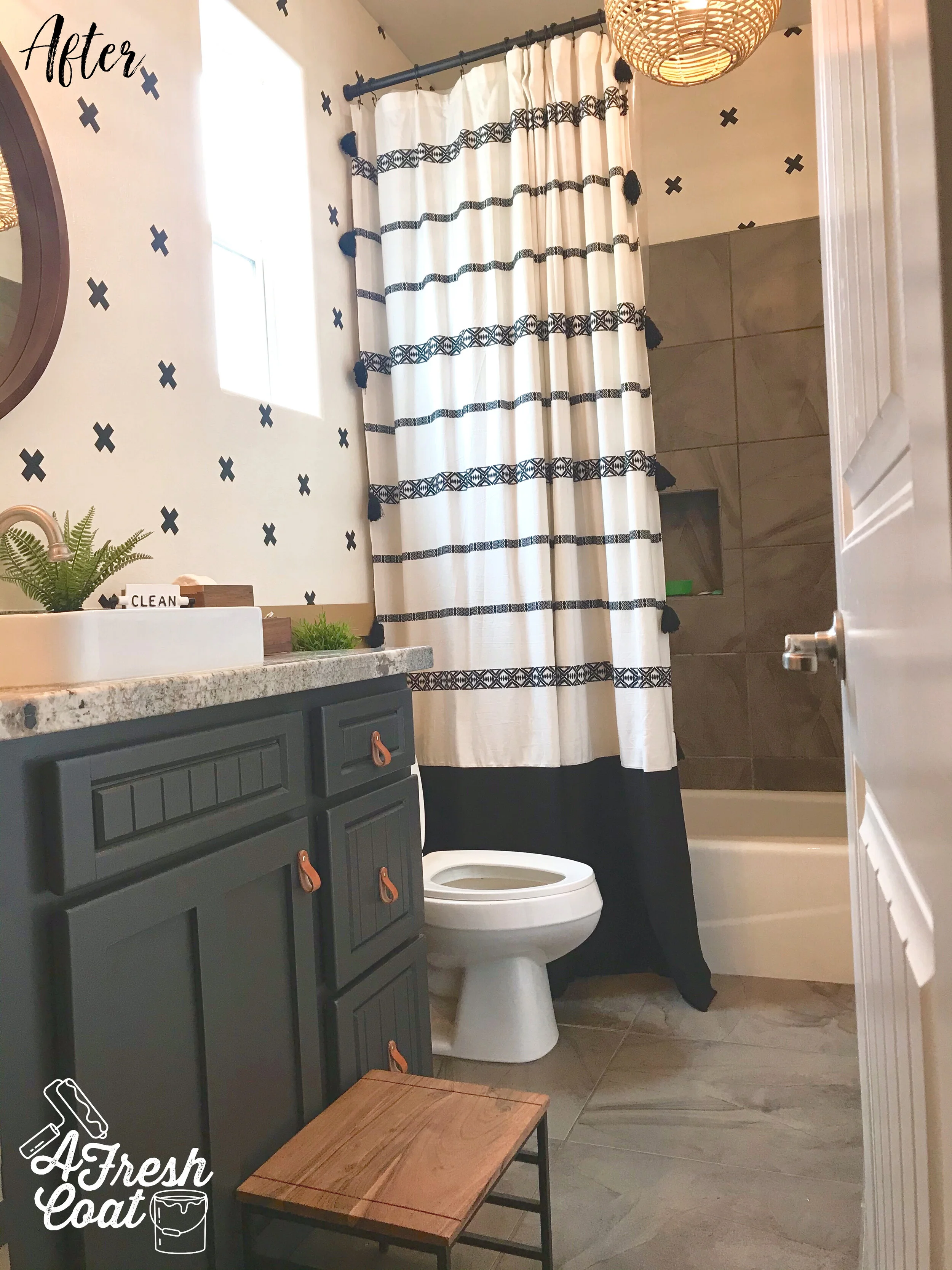
The shower curtain is the same Wal-Mart piece I’ve used in a previous client’s refresh. With black fabric added to the bottom and a modern shower curtain rod placed high, it looks super cute and fun. Also, how about that light? Mrs. “M” selected this sweet thing and I totally love it.

Boy's BOHO Bathroom 6.jpg

Here’s a shot of that great mirror, the recently painted black cabinetry (Valspar’s Iron Ore), and those charming (yet masculine) leather drawer pulls all the way from Poland. Yes, Poland!

Boy's BOHO Bathroom 8.jpg

There were a number of vanity lights we could have chosen that would accommodate the Boho style BUT we opted for horizontal caged light (as shown below) fixture, as to not disrupt the height of the mirror. Basically, if we used a vanity with light sconces that pointed downward, they would cause the mirror to sit lower (too low, in fact), and it just wouldn’t look right. The other option was to raise the light fixture and electrical higher on the wall but that was a bit involved. Too involved.

So, we opted for this and I think it looks great!

Boy's BOHO Bathroom 13.jpg

How about this angle? Look at that sweet toilet decal. Perfect for a little (or big) boy’s restroom, don’t you think?

Boy's BOHO Bathroom 5.jpg

Swoon.

Boy's BOHO Bathroom 11.jpg

This stool was a great HomeGoods find. It jived perfectly with the rest of this newly refreshed restroom, and was the perfect height for “H.” Also? It was a total steal at only $14.99.

Boy's BOHO Bathroom 9.jpg

Last but not least is this great print. Mrs. “M” made using Photoshop and the awesome gold frame found on Amazon. A fun saying for a really fun bathroom.

Here are the before and after shots one more time:

Boys+BOHO+Bedroom+1+copy.jpg
Boy's BOHO Bathroom 10-2.jpg

The Details

Paint: Valspar’s Butcher Block and Dogwood Petals, Vanity: Sherwin Williams Iron Ore

Paint Labor: A Fresh Coat

Shower Curtain: Wal Mart

Accessories: Target

Vinyl Decals: Etsy

Leather Pulls: Etsy

Lighting: Wayfair

Mirror: Overstock

Vinyl Decals: Amazon

Curtain Rod: Amazon

Love, J


Urban Bathroom Makeover

BathroomJenny SulpizioComment

I’ve mentioned before that I love brick paneling, right?

I do.

Like, love-love.

The reason? You get a whole bunch of bang for your buck, without the commitment either. Don’t like it in a few years? Take it down, patch the holes and you’re good. Sure, it’s not the real stuff, but sometimes that really doesn’t matter.

Take the “H” bathroom for example. Mrs. “H” hated it. It was the one area of her home that she desparately wanted to re-do, and a space that her guests needed to use most of the time. After our consultation, it was clear that she wanted a unique overall vibe with one-of-a-kind elements that you just don’t see everywhere. With four girls in her home, she desired to keep this space gender neutral, yet fun and hip (does using the word “hip” make me sound un-hip? Thought so). Anyways, here is where we started:

Urban Bathroom Makeover 2.jpg

A terra cotta color was painted on two of the bathroom’s walls, while greige adorned the remaining two. A pedestal sink was in place with a basic vanity sconce and mirror. As Mrs. “H” will tell you, this bathroom was lacking character…but all that was about to change.

With high ceilings and enough room for a larger vanity, this loo just needed to be re-worked.

Ready for the after?

Urban Bathroom Makeover 4.jpg
Urban Bathroom Makeover 5.jpg

Such a big change and I kind of love it.

Now, when I originally designed the mood board for this space, I knew I wanted to find an epic (yes, epic) piece to be used as the vanity. What I found was actually a buffet/sideboard that was then painted and converted specifically for this bathroom. There were a lot of moving pieces and people that had to come together to make this finished room, finished (so make sure to check out the details below for all of the specifics).

In the meantime, here’s some more info.

Once the vanity was a done deal, lighting and that sweet round mirror were the next elements to configure.

BUT, because the only light source in this bathroom was a sconce, I needed to make sure the light given off wasn’t being cast downward by the selected piece. So we went with the glass/matte black finish combo you see below.

Urban Bathroom Makeover 6.jpg

The vessel sink and faucet were also key players in this bathroom makeover. I provided Mrs. “H” with a few options of each of these elements and love what she ended up choosing; a rectangular porcelain white vessel sink trimmed in black with a distressed black matte uni-lever faucet to accompany it. So pretty.

Urban Bathroom Makeover 7.jpg

Last but not least came the decor. Jaxon Blvd signs were selected in black and white paint finishes and rustic wood trim. Monograms were added as were industrial shelves (not pictured). Mrs. “H” introduced her own rugs and a sweet faux tree in addition to.

Urban Bathroom Makeover 8.jpg

One unique, urban bathroom makeover completed.

The Details:

Brick Paneling: Home Depot (installed by Nate Koogle)

Vanity/Buffet: Odds n’ Ends (Imperial Valley)

Vanity Paint: Robert Reyes (SW Tricorn Black)

Buffet Reconfiguration/Plumbing: Nate Koogle

Mirror: Kirkland’s

Vessel Sink: Wayfair

Light Sconce: Wayfair

Vessel Faucet: Wayfair

Signage/Decor: Jaxon Blvd

Drawer Pulls: Anthropologie


Modern Farmhouse Bathroom Makeover

BathroomJenny Sulpizio1 Comment

Whoa! It’s been a long time since I’ve posted here but a number of projects are still underway, while others are wrapping up, and some are just getting started. It’s busy but awesome and I can’t wait to share what AFC has been up to.

For instance, this bathroom—my bathroom, actually. Well, make that the full guest bathroom that sits right off our kitchen and the one that everyone uses. The problem? It was majorly ugly. As in: “it got beat by the ugly stick too many times to count and then came back for more,” kind of ugly. It needed help and was at the top on the list of priorities of projects that needed tackling.

Currently, my daughter claims this bano as her own but since she’s already sixteen and a junior in high school, I didn’t feel the need to fully personalize it or gear it towards her. Instead, I wanted to keep it more of a neutral space, yet give it a modern farmhouse feel.

Here is where we started:

Modern Farmhouse Makeover 1.jpg

When we first looked at this home, one thing was for certain: the previous owners really liked orange tile. So much so that they placed it up the walls, in the showers, encased mirrors with it, created backsplashes with it, and selected this same tile to serve as the flooring for the whole home. That’s commitment for sure. But it’s also what I dislike most about my home. Not only is it NOT my signature color, but it totally dates and darkens our space, and doesn’t fall in line with my design style…like, at all.

Looking at the pic above, there were a number of issues I wanted to address right off the bat. They are as follows;

  1. Rip out the orange tile (given).

  2. Remove that vanity sconce light and re-route the electrical to the ceiling.

  3. Close off the ice block window with a more functional option.

  4. Update the sink/granite countertop and faucet.

  5. New mirror.

  6. Paint the vanity cabinetry instead of replacing.

  7. Redo the tile flooring and shower areas (future project).

One of the main issues I wanted to tackle in this space was storage. My daughter only has the limited area under the sink for all of her toiletries, makeup, and hygiene items. Not good. I decided that rather than hold on to the ice block window that was originally installed, I would close it off with a medicine cabinet instead. This would take away all natural light coming into the space but it really didn’t bother me. I was much more excited at the prospect of a frameless recessed storage cabinet than I was a window.

See what I mean?

Modern Farmhouse Makeover 2-2.jpg

This area just screamed “close me off and give me storage.” So I did.

Ready for the reveal? Now keep in mind—as I was planning this room in my head, I wanted to marry traditional farmhouse elements with a more modern feel, yet provide masculine AND feminine touches.

Modern Farmhouse Makeover 3-2.jpg

I know, I know—I got in the pic by accident, but still. Isn’t she pretty?!

Here’s another angle. Not the best but the space is so narrow that it’s hard to get a high quality image without yours truly front and center..

Modern Farmhouse Bathroom Makeover 4.jpg

This bathroom was completed in a number of steps. First, I busted out the tile (side backsplash) on both the left and right walls. It was therapeutic for sure but left gaping holes that needed to be patched and drywalled. I left the back wall of tile in place since that was going to be shiplapped over.

Next came the painting of the vanity (SW Tricorn Black), along with the construction of the concrete sink. I’ve always wanted to implement concrete into a bathroom or kitchen surface and thought this would be the perfect space to test it out. Look at this baby up close ( thanks to Kyle Hardin of Hardin Development):

Modern Farmhouse Bathroom Makeover 5-2.jpg

Mind blown.

I then implemented a modern black matte faucet (Jacuzzi). Simple and yet super sleek and pretty.

Shiplap was next. Kyle Hardin attached the panels and added the trim, and then hung the mirror that I’ve had in storage for over a year (Kirkland’s).

Last but not least, the pendant light. This is one of those feminine touches I was mentioning before. With bold selections in both color and elements throughout this makeover, a bit of feminine was needed to balance it out. This was achieved in the shape of the glass pendant and the element of glass itself.

You can find this exact one on Wayfair. Her name is Nadine. Go get ‘er.

Nadine+1-Light+Single+Schoolhouse+Pendant.jpg

Oh! And I almost forgot: knobs! The knobs on the vanity needed to be changed out and honestly, one of the best places to find really fun knobs (aside from Amazon) is Hobby Lobby.

Modern Farmhouse Bathroom Makeover 6.jpg

Just what I wanted. Kind of a muted copper (like an old penny), and at $3.99 with 50% off this past week, it was meant to be.

Ready for the before and after shots one more time? Always so fun to see.

Modern Farmhouse Makeover 1.jpg


Modern Farmhouse Bathroom Makeover 7.jpg

THE DETAILS:

Vanity Re-paint: My guy, Robert—SW Tricorn Black, Satin finish

Concrete Sink: Kyle Hardin (Hardin Development)

Faucet: Jacuzzi brand found at Lowe’s

Pendant Light: Nadine Schoolhouse Pendant Light—Wayfair

Knobs: Hobby Lobby

Mirror: Kirkland’s

Shiplap: Lowe’s. Installation-Kyle Hardin

Frameless Medicine Cabinet: Wayfair

Electrical Work: Mike Fredricks